Responsive Design challenges for iPhone

I was working on responsive design for mobile website, and there were some issues that I faced, especially in iPhone (safari browser). I have listed them below

  1. When i was using input text tags in my html code, I saw that on trying to enter text inside it or you could say on adding focus onto that input tag the web page automatically zoomed in to a particular level, just to make the content readable. It was OK to me until that but the issue it didnt go back to the previous zoom level. This behaviour was in Safari browser in iPhone. Upon looking into it I came to know that whenever the font-size of the input field is below 16px then the safari browser automatically zooms in the input field to make it more readable. So, in my case setting the font-size to 16px broke the rest of the UI for me as I would have to change other font-sizes as well just to match that particular input field. So i chose to use a hack for iphones by setting the meta tag property of user-scalable = “no”, to prevent zooming. This is the JS code that i used
    var isiDevice = function() {
      return /ipad|iphone|ipod/i.test(navigator.userAgent.toLowerCase());
    }
    
    if (isiDevice()) {
      var viewport = document.querySelector("meta[name=viewport]");
      viewport.setAttribute('content', 'width=device-width, initial-scale=1, user-scalable=no');
    }
    

    Of course there are many other ways to accomplish this, one would be to actually follow the convention of setting the font-size of text inputs to 16px.

  2. Next thing that i observed was that if the div is scrollable by using the property overflow: scroll in CSS, then the scroll bar was not visible in safari browser. So inorder to display the scroll bar I would suggest to use the code below in your CSS for that div.
    webkit-overflow-scrolling: touch
    

    This again is just a hack. You can read more about this property in this article about momentum scrolling.

  3. I was using sessionStorage of browser to store some key value pairs inside it. But the strange thing is that the sessionStorage doesn’t work in private mode of Safari browser. It throws an error when you try to set any keyvalue pair in it. So just a heads up in case you suddenly wonder whats really going on in the background. It maybe because of the private mode in safari.
  4. I was implementing hamburger menu for the website. So when the menu was in open state it was observed that if you wanna scroll down in iphone browser you get a unexpected jerk where the page behind the overlay also scrolls upon scroll the hambuger menu. I used a fixed overlay to hide the contents of main page when the menu is open and also used fixed position for the menu in open state that lies above the overlay using z-index.
    .overlay {
      position: fixed;
      top: 0; bottom: 0; right: 0; left: 0;
      background: rgba(0,0,0,0.5);
      z-index: 1;
    }
    
    .hamburger-menu {
      position: fixed;
      overflow: scroll;
      height: 100%;
      width: 75%;
      max-width: 285px;
      z-index: 10;
    }
    
    body{
      position: fixed;
    }
    

    I used position fixed on overlay and made it to cover the entire page to make sure the page isn’t scrollable after this. This worked as a charm in android browser but in iphone browser the page was still scrollable to some extent. So as a hack for it. I added position: fixed on the “body” tag. That solved the issue.

  5.  Another problem that you will face is the automatic scroll up of page when the input field is present at the bottom of the page. Also you need to handle the scroll event in a efficient way because of the keypad that pops up whenever you focus on any input text field. So i would suggest you keep the height of your section containing input field around 50px more than usual just as to prevent the hiding of input field when you are trying to type anything. It gives a bad user experience if you cant see what you are typing.

So these were the key points to keep in mind while making your site responsive. Also try keeping the divs height width as relative as possible. Use % for metrics, for making it scalable on all devices. As the responsive design is all about aligning the content vertically so you would often come across a problem where you would want your content to be vertically center aligned. Then try to use display : table, table-row, and table-cell to achieve this, or use display: flex. Read more about flexbox here.

Here is a demo of using display: table for vertically arranging divs. Sometimes you need that your div cover up the remaining height of parent div. Here is how you do it.


Thanks for going through the post. Hope you liked it.

Responsive Design using rem, em and px

Hi Again,

Today i will be discussing the use of em, rem and px in responsive design mode. In the classical web design we used to use px for fonts and other metrics, and still many of us are using this kind of practice. But is there something wrong with this approach? Suppose you have a scenario where you need to play with the font sizes. Suppose you need to increase the font size of a particular section, so in that case one approach is going through each child element and setting the font sizes to a desired value. Still thinking what’s wrong!

In the time where you would want every part of your application to be modularised. You also need to take this into consideration. Follow a particular structure when you are using metrics in your CSS. Nowadays we are more focused towards making our site responsive. In that case a structured CSS may come in handy, as it is observed that the fonts are desired to be a bit larger as compared to desktop version to improve visual quality and refinement.

This is where you want your fonts, padding and margin to be relative rather than absolute. This is to avoid the scenario of modifying these metrics for every element and this also makes the CSS lengthy. So CSS offers rem and em to add the relative nature to your metrics.

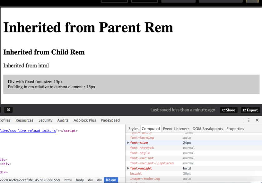
Now lets understand what rem and em is. Every browser predefines a certain font-size to every element that inherits html and body. So whenever you specify the font-size of a element, it basically overwrites that browser’s property. Browsers also follow rems and ems to specify the default font-size. Now Rem is relative to the html tag’s font-size, while the em is relative to the current element if the font-size is specified inside that element or relative to the nearest parent that has font-size specified. I know this sounds confusing, so i m sharing a Demo to explain things better.

View on Codepen

By default the html’s font-size is set to 16px. So when I use 1 rem unit it means I m assigning 16px font to that element. Here i have overwritten it to prevent browser dependency. You can inspect the output in console in the computed section to see what i was talking about.

Screen Shot 2016-03-13 at 7.21.34 pm

Now we need to follow a particular convention to make good use of rem and em. Use rem for Global styling while use rem for local styling. Like specifying the container divs style in rem, and for elements like h1,h2,p etc. use em styling. That makes the fonts more scalable and easy to edit.

Thanks.

If you found this post useful do comment or like. 🙂

Lazy Loading for images Implementation

I m sure many of you aspiring web devs must have come across performance improvement techniques to improve loading time of web page. It is necessary to have non-blocking resources in your web page so that the content is not blocked. By default HTML and CSS are blocking resources. Apart from that JS can be made non-blocking by loading it asynchronously or loading it in the end, when all resources are loaded and rendered. If your website is really interactive, it will be full of images. And these images eat up most of ur loading time. So lazy loading is needed for this purpose, such that only those images have network call that are present in viewport, while others are not. You will notice a fair amount of improvement after implementing this.

I have come up with a lazy load implementation with jquery and some Javascript.

function lazyLoadOnScroll() {

// image array
this.images = [];
this.lazyCount = 0; // keeps the count of elements legible for lazy load

// fetches the elements with lazy class and filters the one that are not to be displayed on mobile
var query = document.querySelectorAll(‘.lazy’);
for( var i=0; i< query.length; i++) {
if (query[i].getAttribute(‘data-background’)) {
images.push(query[i]);
lazyCount++;
}
}

// checks if the image exists inside the viewport and is visible
this.isElementInViewport = function(el) {
var rect = el.getBoundingClientRect();
return (
rect.top >= 0 &&
rect.left >= 0 &&
rect.top <= (window.innerHeight || document.documentElement.clientHeight) &&
$(el).is(‘:visible’)
)
}

// sets background images of div or src of image tag
this.loadImage = function(el, callback) {
var imgSrc = el.getAttribute(‘data-background’);
if (imgSrc) {
if ($(el).hasClass(‘lazy_parent’)) {
var imageTag = el.querySelector(‘img’);
if (imageTag.getAttribute(‘src’) !== imgSrc) {
imageTag.setAttribute(‘src’, imgSrc);
}
}
else {
el.style.backgroundImage = ‘url(‘ + imgSrc + ‘)’;
}
}
$(el).removeAttr(‘data-background’);
callback ? callback() : null
}

// initializes the lazy load
this.lazyInit = function() {
for (var i = images.length-1; i>=0 ; i–) {
if (isElementInViewport(images[i])) {
loadImage(images[i], function() {
images.splice(i,1);
lazyCount–;
});
}
}
}

if (lazyCount > 0) {
lazyInit();
}

// touchmove for mobile devices and executes lazy load on scroll for other devices
scrollEvent = $(window).on(‘scroll touchmove’, function(event) {
lazyInit();
if (lazyCount == 0) {
$(this).unbind(event);
}
});
}

Now lets go part by part of this function lazyLoadOnScroll().

Here is the working demo for this code..

To load the image using lazy load, add ‘lazy‘ class on the element. If you are using image tag then on the parent div add ‘lazy’ class and along with that add ‘lazy_parent‘ class. Its that simple. Now the key here is we dont specify the background-image property or add image src attribute for images. Coz on adding this property the images network call will be done. The key is to store the image url in data-background tag and load the images after the JS is loaded and load the images using JS. This will help you in avoiding unnecessary network call at the time of page rendering.

First of all I have defined an image array (images) that will contain all the elements containing lazy class. Next variable is lazyCount which stores the count of all elements having data-background set to some url. In the next section I m just fetching the elements having lazy class and pushing those elements in image array while increasing the count for same.

Next up is a function that checks whether the image is present in viewport or not. This function is the key to decide whether to load the image or not to. It uses the bounding rectangle property of Javascript element, to get the height, width, top, bottom, left and right. Along with that it also confirms if the element is visible or not. Coz there are some scenarios in which you would need to show some images dynamically and would not show images in the beginning. Then you would have to trigger the lazyLoadOnScroll function on the show event of image.

Next function loads the image or you could say makes the network call for that image, by adding that image’s src or setting the background-image property if its not an image element. Like I said earlier just add the ‘lazy_parent‘ class on the parent div of image tag. It reads that and changes the src of child image tag. In the end it deletes the data-background property and pops that element from ‘images‘ array, which is provided in the callback function.

Now we just have to iterate through all array elements and check if it exists in the viewport and load images accordingly. On page load the function should be triggered. So call the lazyLoadOnScoll function() on page load event. LazyInit is called to initialize the lazy load. Now to idea was to load images only if they are present in viewport. So on window scroll event i have attached the function to load images. And on completion of loading of images the event is removed.

Now for CSS i would like you add transition property on your element with lazy class just to give it a bit of fade effect.

.lazy {
-webkit-transition: background-image 0.3s ease-in-out;
-moz-transition: background-image 0.3s ease-in-out;
-o-transition: background-image 0.3s ease-in-out;
transition: background-image 0.3s ease-in-out;
background-position: center top;
background-repeat: no-repeat;
}

Thanks for reading this post. If you find it useful do comment.


Iteration with deletion in Array JS

We often face a basic problem of iteration through an array in Javascript, but recently when i was implementing lazy load in my app, I came across a problem in which i had to delete the element parallely as i was iterating through the array, to avoid running two separate loops for both. So there are 3 approaches that i tried which i will explain below, and only one of them is a correct way to do it.

1.  Running a basic for loop from i=0 to i= array.length

var dummyArr = [1,2,3,4,5,6]

for (var i=0; i< dummyArr.length; i++) {

if ( dummyArr[i] == 2 || dummyArr[i] == 3) {

dummyArr.splice(i,1);

}

}

Now this will give output as dummyArr = [1,3,4,5,6]. It skips the ‘3’ coz after splice is called the indexes in array are modified, just for starters splice is used for deleting element in array (Array Splice). So that element was skipped

2.  Next approach that i tried was using forEach method ( forEach ) in JS. It also does the same thing as basic for loop, but in my conquest towards becoming a better JS dev. I try to use some new and cool things for my code to look better.

var dummyArr = [1,2,3,4,5,6]

dummyArr.forEach(function( elem, index) {

if (elem == 2 || elem == 3) {

dummyArr.splice(index,1);

}

});

So like I said it does the same thing as a basic for loop, nothing fancy. It ignores the elements that are newly appended and skips the indexes that have been deleted.

Output — dummyArr = [1,3,4,5,6]

3.   Last and apt approach was running a reverse for loop through the array.

var dummyArr = [1,2,3,4,5,6]

for (var i=dummyArr.length -1; i>=0;  i–) {

if ( dummyArr[i] == 2 || dummyArr[i] == 3) {

dummyArr.splice(i,1);

}

}

Output — dummyArr = [1,4,5,6]

Now in this case on deletion of element and modification of index the upcoming element’s position and value are not compromised which was happening in previous cases. So the element can be deleted as u desire it to be.


Thanks for going through the post.. Will come back with a new post soon.

Adios